Responsive web design or just ‘responsive design’ is the art of building a web page or application in a way that works well at any screen width. The advantage of this is, completely separate versions of that page are not required for desktops, laptops, tablets and phones. Because these devices can have very different amounts of space available, it isn’t just enough to produce a smaller version of something. Often, elements on the page need to be re-arranged, individually resized or in some cases hidden on smaller screens in cases where overall usability is better with fewer features being visible.
In traditional web development, the techniques are well understood and proven, but it can all get quite technical and very time consuming to get just right. The techniques involved usually include something called media queries which detect whether the screen is above or below a different width. The web developer can then apply additional styles to parts of the page when these media queries are triggered. These styles can make an element hidden or shown, change its width, or affect how it flows in the page, e.g. whether it’s on the same line as the preceding element or starts a new line below.
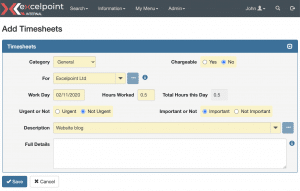
The good news is that the Excelpoint user interface is fully responsive in this way, and all the hard work has already been done. When you build a screen layout, it’s automatically responsive out of the box. To give an example, here’s a simple timesheet input screen, shown at a typical desktop width:

You can see that there’s plenty of space for the form itself, we have a full menu at the top, and down the left, we have some recent activity links.
If we view the same page on a slightly smaller screen, e.g. a tablet or smaller laptop, we see this:

Here the form is still laid out in the same way, but the inputs have been made proportionally smaller, and the recent activity panel has is automatically hidden to make more space for the form itself. All of this happens without any action taken either by the user or by the person creating the form.
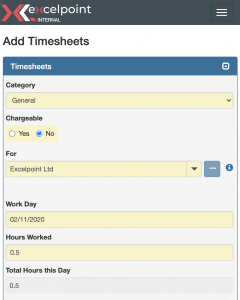
Finally, if we go smaller still to the size of a mobile phone, we can see that the layout’s changed entirely. Inputs are laid out vertically, and the menu becomes a ‘burger’ icon, i.e. the three bars, which would expand down when clicked.

Responsive design is a very big and complicated subject that can’t be explained or summed up in one blog. But hopefully, this quick and brief read has given you some insight into the complex challenges faced within responsive web design.
